Wednesday, September 9, 2009
more sketch cards
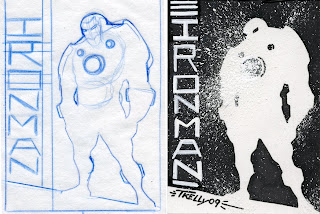
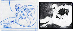
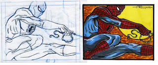
hey all as with keeping with the focus of the blog, here is some more insite to my art process. These are sketch card commissions I did the other day they are 2.5x3.5 inchs so they are smaller than I normally work. Since the cards are smaller than my normal taste I worked up a rough at a more comfortable size for each card then scanned them, then scaled each image down to the card's size and printed them out. The next faze is the part on the left I worked the rough up to a more finished/cleaner state in blue pencil then light tabled the image onto each card. Once penciled on the card I started to color each card using copic markers. I usually try to color the lightest colors first then move to darker and darker leaving the black line for last. I do this process to build richer tones and gradual transitions also I use both warm and cool tone grays to add to the shadows. On the B/W cards I focused on using a white silhouette and White ink spatter(via a old toothbrush) to create a more dynamic effect for a simple static pose. Also on a side note I usually keep a few old tooth brushes around some I never clean the ink off so they are much stiffer and produce a different type of spatter effect.
sketch card process iron fist and hawkeye
hey all as with keeping with the focus of the blog, here is some more insite to my art process. These are sketch card commissions I did the other day they are 2.5x3.5 inchs so they are smaller than I normally work. Since the cards are smaller than my normal tastes I worked up a rough at a more comfortable size for each card then scanned them then scaled each down to the card's size and printed them out. The next faze is the part on the left I worked the rough up to a more finished/cleaner state in blue pencil then light tabled the image onto each card card. Once penciled on the card I started to color the card using copic markers. I usually try to color the lightest colors first then move to darker and darker leaving the black line for last. I do that process to build richer tones and gradual transitions also I use both warm and cool tone grays to add to the shadows. On the Iron Fist card I did one extra step Which is using White ink spatter(via a old toothbrush) to create a energy effect/glow from the characters fist. Also I decided to white over the other fist to help bring the glowing fist forward to the viewer.
Subscribe to:
Posts (Atom)